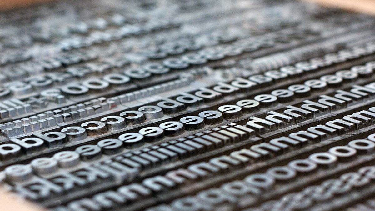
Helvetica Now: Refreshed for the Modern Age
Since this sans-serif typeface was developed in 1957 by Swiss designer Max Miedinger, Helvetica has grown in popularity, appearing everywhere from signage in the New York City Subway system to advertising for Toyota, American Airlines and Panasonic.
However, despite its popularity, the font hasn’t been updated since 1983 when Neue Helvetica, the digitized typeface for low-resolution screens and printers, was introduced. The 1983 remodel was not designed to be used on billboards or 21st-century screens and lacked the appropriate variety in weights and sizes.
The elegance and simplicity of Helvetica piqued the interest of many tech companies. However, due to issues in spacing, sizing and letter shapes on high-resolution screens, many tech companies developed their own fonts inspired by Helvetica. Apple, Netflix, and Google all redesigned and personalized their own typeface to fill the gaps Neue Helvetica was leaving behind. Seeing how loved the font was and how frustrated certain companies were becoming, a refresh of the font was proposed.
Monotype Imaging Holdings, which controls the licensing for Helvetica, took 5 years perfecting the updated version of the font called Helvetica Now, with the specific goal of accommodating designers in the modern age. Helvetica Now offers three new sizes, inclusive to everything from billboards, to closed captions, to the micro-screens of smartwatches. All to solve the issue of uneven spacing between letters at different sizes.
The relaunch of the font boasts 40,000 characters has been redesigned including, a capital L easily distinguishable from the number 1 and the lower case l, a “straight-legged” capital R, and an updated @ symbol.
“Helvetica is like water. It’s essential. It’s everywhere. Everyone sees it, reads it, and uses it. Some very actively, and some without even thinking,” said Monotype director Charles Nix in a video unveiling the update. “It’s a benchmark. A typeface against which others are judged.”
Helvetica Now’s launch set the new benchmark against which typefaces of the digital age will be judged and a golden standard for digital compatibility that fonts will try to meet.
By the way, there even is a documentary about Helvetica:
Top photo: Marcin Wichary / CC BY
Please Support us on Patreon!
 The minimum level of contribution is only $1 per month.
Moreover, starting with the pledge level of $3, you will get a digitized vintage book about bookbinding, book history, or book arts each month from us!
These pledges help iBookBinding to continue its work and bring more information about bookbinding and book arts to you!


